Thursday, March 11, 2010

Update: The Need for ViewModels

Well, I left out something that was very close to my heart having been developing UI based applications for such a long time.  That’s testability:  How do you Unit Test your UI with standard / Open Source tools (Project White – now rechristened White -  is one I experimented with couple of years ago).  Though, Microsoft has made it easier than ever before to automate UI for testing with Automation APIs,  if your UI is clearly separated, you could just use MSTest/XUnit frameworks to Unit test.

Wednesday, March 03, 2010

Using ICommand & Triggers – Approach #1

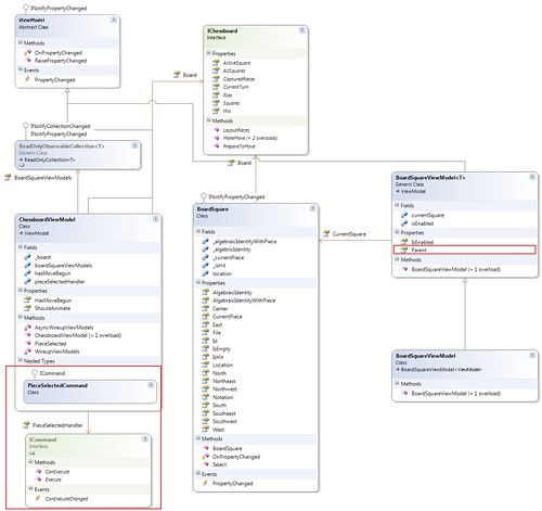
The ChessboardViewModel defines a event handler by exposing a PieceSelectedHandler property. This property returns an object implementing the ICommand interface. The Style trigger on the BoardSquareView binds to this property by accessing the Parent property of the BoardSquareViewModel. The Parent property on the current ViewModel allows accessing the ViewModel's enclosing ViewModel, which in this case is the ChessboardViewModel.

Traversing the ViewModel tree like this adds dependencies and I believe should be used judiciously. This is where RoutedCommands and events could fit right in. More on this later. Blogging from an iPhone is not easy! [Update: Edited from “I’m a PC” ;)]

ViewModelTree


Even though, the CanExecute() and Execute() is called – correctly – if I were to wire up the command from the style trigger as below, there’re few issues:

            <Style.Triggers>

                <Trigger Property="IsChecked" Value="true">

                    <Setter Property="Background" Value="DarkBlue" />

                    <Setter Property="Foreground" Value="LightGreen" />

                    <Setter Property="BorderBrush" Value="LightGreen" />

                    <Setter Property="BorderThickness" Value="2" />

                    <Setter Property="CommandParameter" Value="{Binding}"/>

                    <Setter Property="Command" Value="{Binding Parent.PieceSelectedHandler}"/>

                </Trigger>

            </Style.Triggers>

  1. CanExecute() – and Execute() subsequently - get called twice for a single click
  2. Order of CommandParameter assignment seem to matter.  If CommandParameter is assigned after Command property assignment, the first call to CanExecute() is passed ‘null’
  3. None of the auto-magic enablement/disablement of buttons (not RadioButtons?) associated with RoutedCommands are evident when you use ICommand

Tuesday, March 02, 2010

Shatranj Updated

ViewModel tree has been introduced and been tied to the Views.

Next Steps:

  1. Have the board respect turns
  2. On selection, a piece must indicate on board the legal moves
  3. The player should be able to move his/her piece to the desired square
  4. Player should be able to customize the starting position of the board
  5. Integrate with Huo Chess
  6. Port to Silverlight 4.0
  7. Make it a multi-player game?

The Need for ViewModels

A Recap:

  1. A GameView –> ChessboardView –> ItemsTemplate –> Items (BoardSquareView in DataTemplate)
  2. GameView uses Game object (Model) as a resource or creates and assigns the Game object to GameView’s DataContext property
  3. Game exposes Chessboard as property
  4. Chessboard exposes ObservableCollection of BoardSquare objects

The code we’ve seen thus far there’s no real difference in functionality if we do not have ViewModels.  In fact, we could use the code-behinds to infuse Views with ViewModel behaviour.  Of course, at design time, there’s still a clean separation:

  1. XAML is in a separate file
  2. Code-behind is a separate file too
    • In classic implementation, you typically would have tons of code assigning values to the controls and objects here.  Let’s just forget for now what pundits would say about such implementation!
  3. Models

Unfortunately, at compile time and hence at runtime, the view requires the code-behind.  Since code-behind is so intricately entwined with the view, it’s important to shun it for holding the UI state. 

Why is UI state such a big deal?  Now, let’s say we want to hold state of the controls.  For example, we have a ‘Turn’ property in the Chessboard model indicating whose turn it is.  We could use it to control which ones to enable and disable.  Assume, we’ll use triggers ingeniously to control and make the view hold this state. The more complex the interactions, the more complex the view would become.  Does that belong there?

Another question is do we care?  Why is this important that we use this another level of indirection? 

It’s elementary, my dear Watson!

It’s all about replacing the View at will.   When XAML allows you to craft your individual controls on screen to such granularity, why turn your back for replacing your application’s entire UI?  Assume, you want to deliver your applications in multiple flavors.  One that takes full advantage of WPF and yet another that runs inside the browser. 

Silverlight 3.0, for example, doesn’t support many of the features that WPF provides.  Triggers are one.  We’ll see what it takes to do this when we release Shatranj for Silverlight 4.0.

Lo and behold!  Enter ViewModels!


Monday, March 01, 2010

Shatranj – WPF Dependency Property value providers & Resolving Conflicts

We’ve couple of wrinkles in the “final” code there.

  • Border has a name specified.  It’s not a problem in itself.  Problem is the name is used by the template style trigger to set the value.
  • Both values are specified using Template triggers and when there’s a conflict, the last one wins.  This is a big one!

TemplateTriggerConflicts

  • Border properties values do not respect the values set at RadioButton level

Fix

1. Use TemplateBinding

<Border BorderBrush="{TemplateBinding BorderBrush}"

    BorderThickness="{TemplateBinding BorderThickness}"

2. Move the ‘IsSelected’ trigger to an a value provider of higher precedence.  From Adam Nathan’s WPF Unleashed, the precedence is as below:

    • Local value
    • Style triggers
    • Template triggers
    • Style setters
    • Theme style triggers
    • Theme style setters
    • Property value inheritance
    • Default value


So we have 2 options:

  1. Use code-behind and directly set values (Local value)
  2. Use Style triggers

        protected override void OnClick()

        {

            base.OnClick();

            var context = this.DataContext as BoardSquare;

            this.Background = new SolidColorBrush(Colors.DarkBlue);

            this.Foreground = new SolidColorBrush(Colors.LightGreen);

            this.BorderBrush = new SolidColorBrush(Colors.LightGreen);

            this.BorderThickness = new Thickness(2);

            //context.Select(true, MoveOptions.AllApplicable);

        }

Style Triggers


    1 <RadioButton x:Class="Shatranj.BoardSquareView"

    2             xmlns="http://schemas.microsoft.com/winfx/2006/xaml/presentation"

    3             xmlns:x="http://schemas.microsoft.com/winfx/2006/xaml"

    4             xmlns:Shatranj="clr-namespace:Shatranj">

    5 

    6   <RadioButton.Resources>

    7     <Shatranj:ForceToGroupNameConverter x:Key="ForceToGroupNameConverter" />

    8     <Style TargetType="{x:Type Shatranj:BoardSquareView}">

    9       <Setter Property="IsChecked" Value="false" />

   10       <Setter Property="Background"

   11               Value="{Binding Converter={StaticResource LocationToColorConverter},

   12                             Mode=OneWay}" />

   13       <Setter Property="BorderThickness" Value="0" />

   14       <Setter Property="GroupName"

   15               Value="{Binding Converter={StaticResource ForceToGroupNameConverter}}" />

   16       <Setter Property="Template">

   17         <Setter.Value>

   18           <ControlTemplate TargetType="{x:Type Shatranj:BoardSquareView}">

   19             <ControlTemplate.Resources>

   20               <Style TargetType="RadioButton">

   21                 <Setter Property="Background"

   22                         Value="{Binding Converter={StaticResource LocationToColorConverter},

   23                                       Mode=OneWay}" />

   24               </Style>

   25               <Shatranj:BoolToVisibilityConverter x:Key="BoolToVisibilityConverter" />

   26             </ControlTemplate.Resources>

   27 

   28             <Grid Background="{TemplateBinding Background}">

   29               <Grid.RowDefinitions>

   30                 <RowDefinition Height="0.200*" />

   31                 <RowDefinition Height="0.800*" />

   32               </Grid.RowDefinitions>

   33               <Grid.ColumnDefinitions>

   34                 <ColumnDefinition />

   35               </Grid.ColumnDefinitions>

   36               <Border BorderBrush="{TemplateBinding BorderBrush}"

   37                       BorderThickness="{TemplateBinding BorderThickness}"

   38                       Grid.Row="0" Grid.Column="0" Grid.RowSpan="2" />

   39               <Viewbox Grid.Row="0" Grid.Column="0"

   40                       HorizontalAlignment="Right" VerticalAlignment="Stretch">

   41                 <TextBlock FontSize="12"

   42                           FontFamily="Consolas"

   43                           Text="{Binding Path=AlgebraicIdentity, Mode=OneWay}" />

   44               </Viewbox>

   45               <Viewbox Grid.RowSpan="2" Grid.Row="0"

   46                       HorizontalAlignment="Center" VerticalAlignment="Center">

   47                 <TextBlock FontFamily="Chess Cases"

   48                           Margin="3,3,3,3"

   49                           Text="{Binding Path=CurrentPiece.AltChar,

   50                                         Mode=OneWay}" />

   51               </Viewbox>

   52 

   53               <Ellipse

   54                 MaxHeight="30" MaxWidth="30"

   55                 MinHeight="10" MinWidth="10"

   56                 Grid.Row="0" Grid.RowSpan="2"

   57                 Visibility="{Binding IsHit,

   58                                     Converter={StaticResource BoolToVisibilityConverter}}">

   59                 <Ellipse.Fill>

   60                   <SolidColorBrush Color="Black" Opacity="0.5" />

   61                 </Ellipse.Fill>

   62               </Ellipse>

   63 

   64             </Grid>

   65 

   66             <ControlTemplate.Triggers>

   67               <Trigger Property="IsMouseOver" Value="true">

   68                 <Setter Property="Foreground" Value="Red" />

   69                 <Setter Property="Background" Value="Black" />

   70                 <Setter Property="BorderBrush" Value="Red" />

   71                 <Setter Property="BorderThickness" Value="2" />

   72               </Trigger>

   73             </ControlTemplate.Triggers>

   74           </ControlTemplate>

   75         </Setter.Value>

   76       </Setter>

   77       <Style.Triggers>

   78         <Trigger Property="IsChecked" Value="true">

   79           <Setter Property="Background" Value="DarkBlue" />

   80           <Setter Property="Foreground" Value="LightGreen" />

   81           <Setter Property="BorderBrush" Value="LightGreen" />

   82           <Setter Property="BorderThickness" Value="2" />

   83         </Trigger>

   84       </Style.Triggers>

   85     </Style>

   86   </RadioButton.Resources>

   87 </RadioButton>

ChessBoardWith3GroupsOfRadioButtons

Yes, now when you hover d2, d3 or d7, the selected highlight remains (remember, we have three distinct RadioButton groups there)!  Of course, we need to make sure only one group is selectable at any one point of time.  Topic for further posts!