We’ve couple of wrinkles in the “final” code there.
- Border has a name specified. It’s not a problem in itself. Problem is the name is used by the template style trigger to set the value.
- Both values are specified using Template triggers and when there’s a conflict, the last one wins. This is a big one!
- Border properties values do not respect the values set at RadioButton level
Fix
1. Use TemplateBinding
<Border BorderBrush="{TemplateBinding BorderBrush}"
BorderThickness="{TemplateBinding BorderThickness}"
2. Move the ‘IsSelected’ trigger to an a value provider of higher precedence. From Adam Nathan’s WPF Unleashed, the precedence is as below:
- Local value
- Style triggers
- Template triggers
- Style setters
- Theme style triggers
- Theme style setters
- Property value inheritance
- Default value
So we have 2 options:
- Use code-behind and directly set values (Local value)
- Use Style triggers
protected override void OnClick()
{
base.OnClick();
var context = this.DataContext as BoardSquare;
this.Background = new SolidColorBrush(Colors.DarkBlue);
this.Foreground = new SolidColorBrush(Colors.LightGreen);
this.BorderBrush = new SolidColorBrush(Colors.LightGreen);
this.BorderThickness = new Thickness(2);
//context.Select(true, MoveOptions.AllApplicable);
}
Style Triggers
1 <RadioButton x:Class="Shatranj.BoardSquareView"
2 xmlns="http://schemas.microsoft.com/winfx/2006/xaml/presentation"
3 xmlns:x="http://schemas.microsoft.com/winfx/2006/xaml"
4 xmlns:Shatranj="clr-namespace:Shatranj">
5
6 <RadioButton.Resources>
7 <Shatranj:ForceToGroupNameConverter x:Key="ForceToGroupNameConverter" />
8 <Style TargetType="{x:Type Shatranj:BoardSquareView}">
9 <Setter Property="IsChecked" Value="false" />
10 <Setter Property="Background"
11 Value="{Binding Converter={StaticResource LocationToColorConverter},
12 Mode=OneWay}" />
13 <Setter Property="BorderThickness" Value="0" />
14 <Setter Property="GroupName"
15 Value="{Binding Converter={StaticResource ForceToGroupNameConverter}}" />
16 <Setter Property="Template">
17 <Setter.Value>
18 <ControlTemplate TargetType="{x:Type Shatranj:BoardSquareView}">
19 <ControlTemplate.Resources>
20 <Style TargetType="RadioButton">
21 <Setter Property="Background"
22 Value="{Binding Converter={StaticResource LocationToColorConverter},
23 Mode=OneWay}" />
24 </Style>
25 <Shatranj:BoolToVisibilityConverter x:Key="BoolToVisibilityConverter" />
26 </ControlTemplate.Resources>
27
28 <Grid Background="{TemplateBinding Background}">
29 <Grid.RowDefinitions>
30 <RowDefinition Height="0.200*" />
31 <RowDefinition Height="0.800*" />
32 </Grid.RowDefinitions>
33 <Grid.ColumnDefinitions>
34 <ColumnDefinition />
35 </Grid.ColumnDefinitions>
36 <Border BorderBrush="{TemplateBinding BorderBrush}"
37 BorderThickness="{TemplateBinding BorderThickness}"
38 Grid.Row="0" Grid.Column="0" Grid.RowSpan="2" />
39 <Viewbox Grid.Row="0" Grid.Column="0"
40 HorizontalAlignment="Right" VerticalAlignment="Stretch">
41 <TextBlock FontSize="12"
42 FontFamily="Consolas"
43 Text="{Binding Path=AlgebraicIdentity, Mode=OneWay}" />
44 </Viewbox>
45 <Viewbox Grid.RowSpan="2" Grid.Row="0"
46 HorizontalAlignment="Center" VerticalAlignment="Center">
47 <TextBlock FontFamily="Chess Cases"
48 Margin="3,3,3,3"
49 Text="{Binding Path=CurrentPiece.AltChar,
50 Mode=OneWay}" />
51 </Viewbox>
52
53 <Ellipse
54 MaxHeight="30" MaxWidth="30"
55 MinHeight="10" MinWidth="10"
56 Grid.Row="0" Grid.RowSpan="2"
57 Visibility="{Binding IsHit,
58 Converter={StaticResource BoolToVisibilityConverter}}">
59 <Ellipse.Fill>
60 <SolidColorBrush Color="Black" Opacity="0.5" />
61 </Ellipse.Fill>
62 </Ellipse>
63
64 </Grid>
65
66 <ControlTemplate.Triggers>
67 <Trigger Property="IsMouseOver" Value="true">
68 <Setter Property="Foreground" Value="Red" />
69 <Setter Property="Background" Value="Black" />
70 <Setter Property="BorderBrush" Value="Red" />
71 <Setter Property="BorderThickness" Value="2" />
72 </Trigger>
73 </ControlTemplate.Triggers>
74 </ControlTemplate>
75 </Setter.Value>
76 </Setter>
77 <Style.Triggers>
78 <Trigger Property="IsChecked" Value="true">
79 <Setter Property="Background" Value="DarkBlue" />
80 <Setter Property="Foreground" Value="LightGreen" />
81 <Setter Property="BorderBrush" Value="LightGreen" />
82 <Setter Property="BorderThickness" Value="2" />
83 </Trigger>
84 </Style.Triggers>
85 </Style>
86 </RadioButton.Resources>
87 </RadioButton>
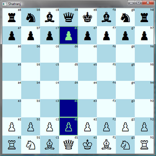
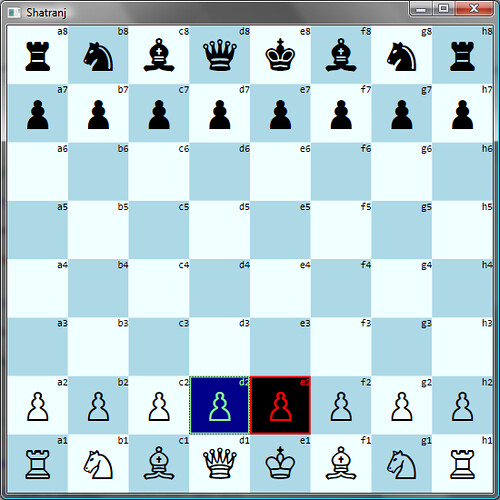
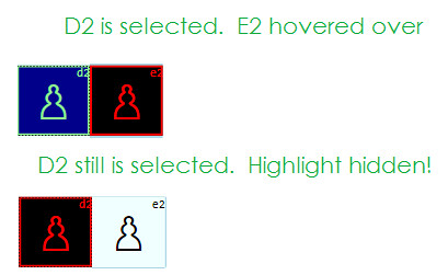
Yes, now when you hover d2, d3 or d7, the selected highlight remains (remember, we have three distinct RadioButton groups there)! Of course, we need to make sure only one group is selectable at any one point of time. Topic for further posts!